A New Look For Our Academy Students – Term 2, 2018
Alhamdulillah, with the launch of Term 2, 2018, we have introduced a new look for our Academy dashboard.
![]()
The new user interface not only looks good, it also has a number of features that we think that will improve the usability of the dashboard.
Here are just a few of the features:
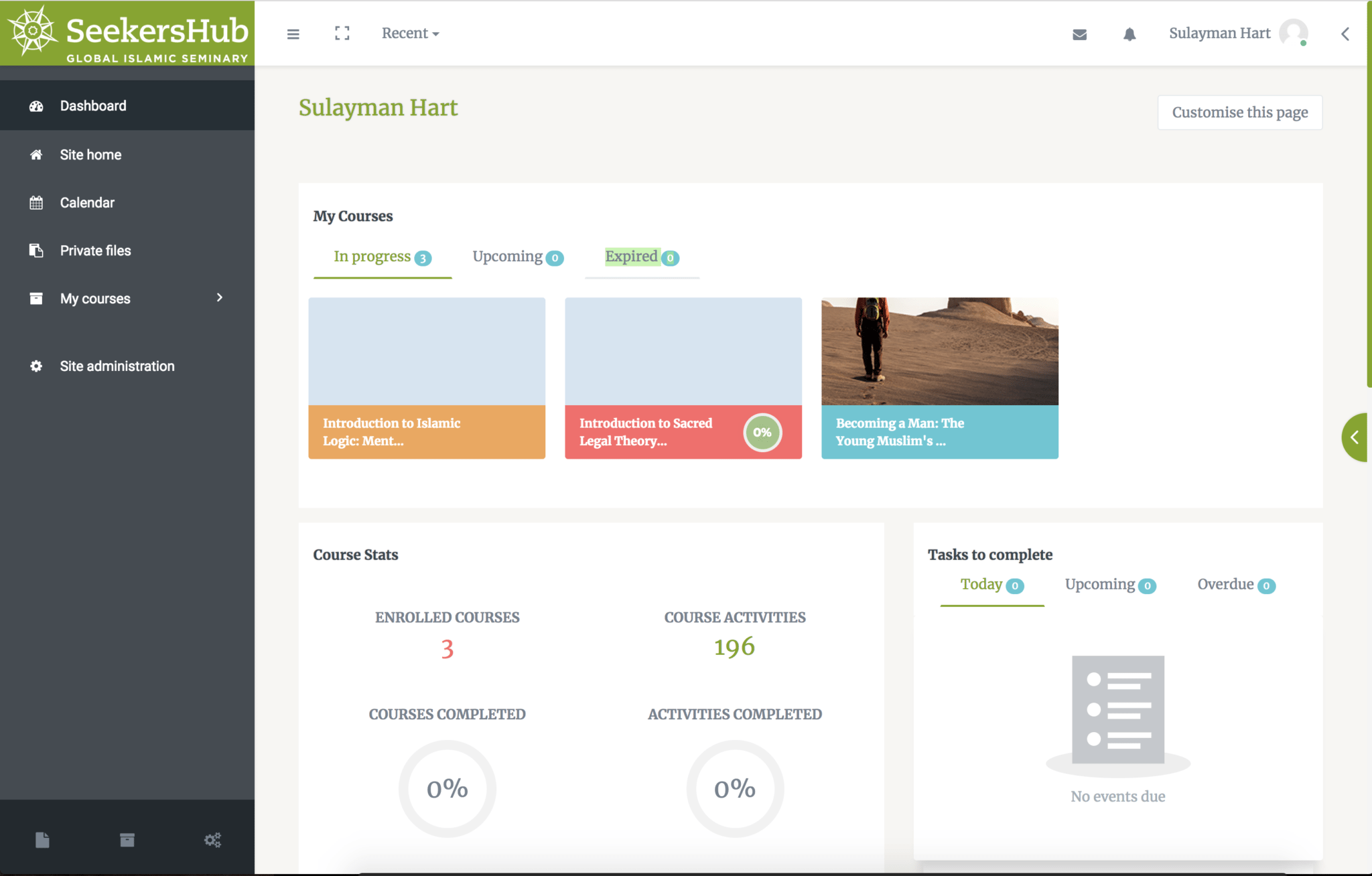
- A Profile Page which is fully designed to give you a quick glance over your entire activities.
- A minimal approach to Course Archive page displays only the most necessary details.
- A revamped Single Course page provides every possible course related detail at your cursor tips.
- A distraction-free learning to a new level with “Full-Screen Mode.”
- A cleaner, sleeker and feature rich calendar.
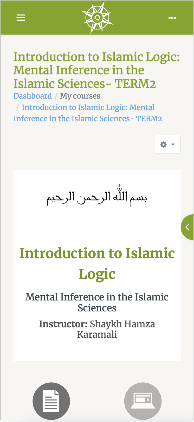
- A responsive theme that is adaptive to the device you are using.
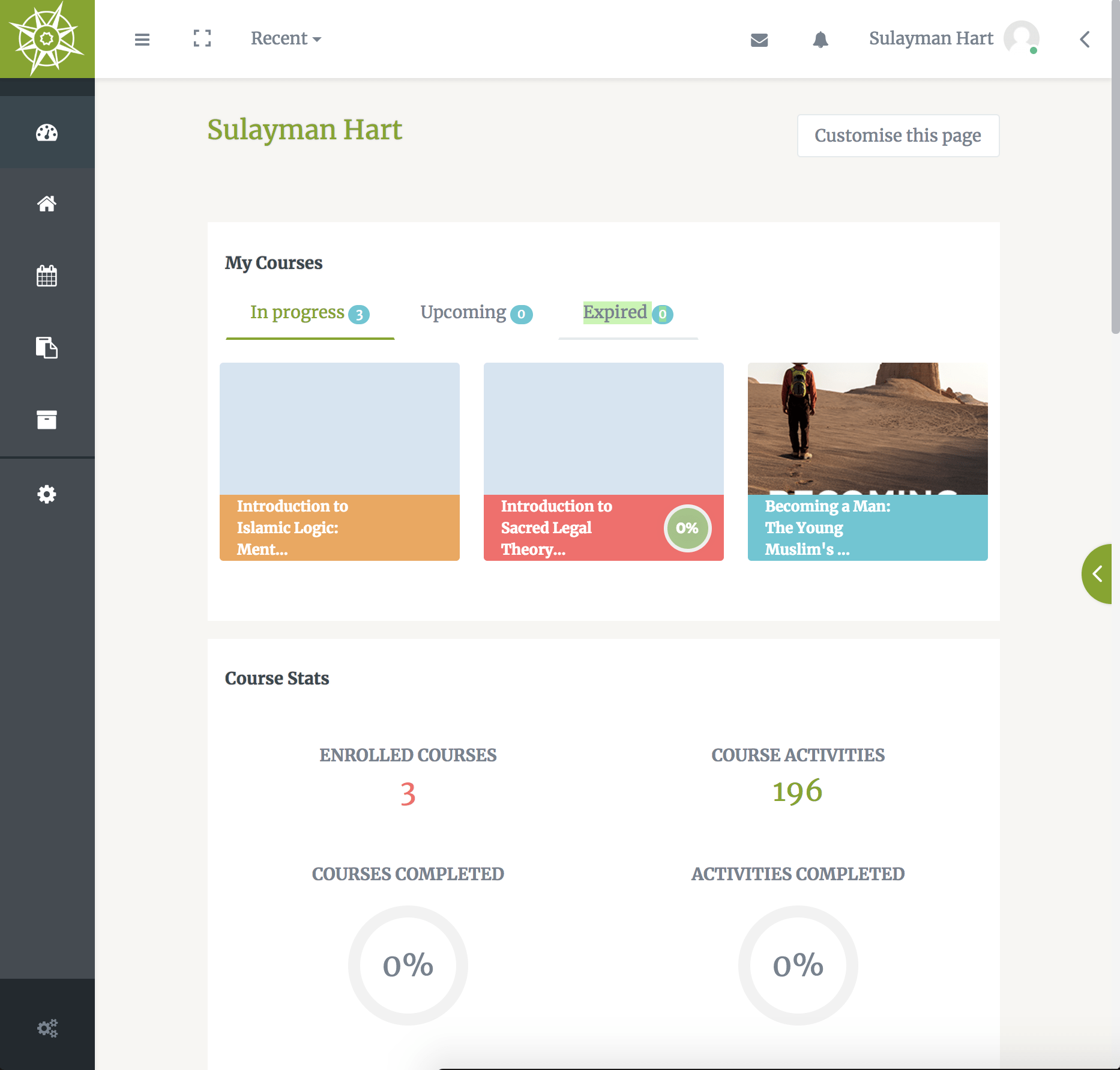
The different styles, depending on what device you are using, can be seen below.
Register for a course today, and see the new user interface for yourself.

TABLET VIEW

DESKTOP VIEW

MOBILE VIEW
REGISTER for Term 2 Courses 2018 Now. We’ve extended the deadline!
